When I set out to brand Creative Sweets, I wanted the entire experience—from the logo to the website—to feel like unwrapping something delightful. The concept began with a simple idea: make great creative feel approachable, fun, and crave-worthy.
Logo & Visual Identity
The logo mark blends a “C” and an “S” into a stylized candy wrapper—symbolizing a bite-sized agency with big impact. Its round edges and soft geometry reflect the brand’s playful tone, while the high-contrast palette of Grape Soda, Rock Candy, and Mint Chocolate Chip ensures it still feels bold and modern in a B2B space. The tagline “Big Agency Flavor. Bite-Sized Price.” became the north star, grounding every design decision in that tension between sophistication and approachability.
Typography & Color Story
I paired the strong sans-serif Versalite with the friendly, open curves of Poppins to mirror the brand’s dual personality: professional yet personable. The color palette feels like walking into a modern candy shop—bright, energetic, and just a little rebellious. Each hue was chosen to feel vibrant enough for digital screens yet sophisticated enough to anchor corporate collateral.
Graphic System & Layouts
The supporting visuals—rounded icons, bubbly outlines, and lighthearted illustrations—extend the “sweet” theme without slipping into kitsch. Layouts lean clean and editorial, creating a sense of order amidst the color and whimsy. Every piece of collateral—from case studies and sell sheets to pitch decks—was designed to look cohesive, instantly recognizable, and refreshingly unpretentious.
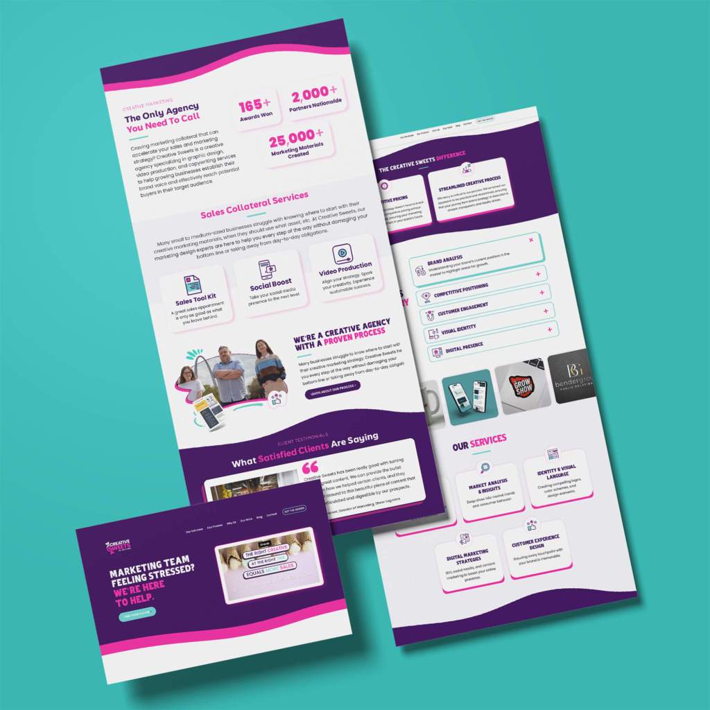
Website & Digital Experience
For the website wireframes, I designed a user journey that felt like walking through a curated candy aisle—guided, intentional, and impossible to leave without a taste. The interface emphasizes clarity and conversion, balancing bold headlines, easy navigation, and visual storytelling to communicate value quickly and playfully.
Collateral & Brand Expression
Sales materials, brochures, and digital templates were built around flexibility—ensuring the internal team could replicate the polished look without a full design crew. Every touchpoint reinforces the brand’s promise: creative that’s strategic, beautiful, and within reach.
In short, the Creative Sweets brand identity was built to feel like a treat—one that invites clients to indulge in high-end design without the sugar crash of big-agency pricing.
